Style a Blockquote using Tailwind CSS
Inspiration
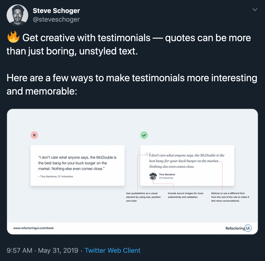
I enjoy Steve Schoger's 🔥 design tips on twitter. Recently, he posted on how to improve block quotes. So I decided to write about how I would go about improving the design of my block quotes for my home page, keeping it accessible friendly, and componentizing it with React.
HTML structure
I always start with the unstyled structure. You need a solid base to build upon. So if we start with the current design markup:
<blockquote>
  <p>"I trust him."</p>
  <cite>
    <a href="...">
      nickd
    </a>
  </cite>
</blockquote>
blockquote makes the most sense considering it is exactly what was displaying. Inside of the blockquote, we add the actual quote inside a paragraph tag, then wrap the persons name inside a cite tag.
We can keep this structure for our new design.
Build off of current design
Taking advice from Steve Schoger's tweet, I will add an avatar, increase font sizes, and add a company link to my design. I already had the font in italic. Now the stylized quote mark looked best for me outside of the quote background.
Here are the classes I used to create the old design. blockquote might seems like it has a lot of classes, but this is pretty tame.
<blockquote className="p-4 italic border-l-4 bg-neutral-100 text-neutral-600 border-neutral-500 quote">
  <p className="mb-2">"I trust him."</p>
  <cite>
    -
    <a href="..." target="_blank" rel="noopener noreferrer">
      nickd
    </a>
  </cite>
</blockquote>
Improved typography and spacing
We'll start with improving the typography and spacing. Increasing the size will make the quote more prominent and we have plenty of space to use. I also prefer slightly larger sizes for text.
+ <blockquote className="relative p-4 text-xl italic border-l-4 bg-neutral-100 text-neutral-600 border-neutral-500 quote">
- <blockquote className="p-4 italic border-l-4 bg-neutral-100 text-neutral-600 border-neutral-500 quote">
+  <p className="mb-4">"I trust him."</p>
-  <p className="mb-2">"I trust him."</p>
  <cite>
    -
+   <a className="text-sm" href="..." target="_blank" rel="noopener noreferrer">
-   <a href="..." target="_blank" rel="noopener noreferrer">
      nickd
    </a>
  </cite>
</blockquote>
Add avatar
Now to add an image and change the link from the persons name to their work. We can use flexbox to easily position the text next to the image.
<blockquote className="relative p-4 text-xl italic border-l-4 bg-neutral-100 text-neutral-600 border-neutral-500 quote">
  <p className="mb-4">"I trust him."</p>
+ <cite className="flex items-center">
- <cite>
-   -
+ <img alt="Avatar of nickd" className="w-12 mr-4 rounded-full bg-neutral-500" src="..." />
+ <div className="flex flex-col items-start">
+   <span className="mb-1 text-sm italic font-bold">
+     nickd
+   </span>
    <a className="text-sm" href="..." target="_blank" rel="noopener noreferrer">
+     Draft
-     nickd
    </a>
+ </div>
  </cite>
</blockquote>
Add stylistic quote mark
Lastly, we're going to add a stylistic quote mark. Now for screen readers, we'll use an aria-hidden attribute because this quote mark doesn't need to be announced. Assistive technologies are already told that this is a blockquote.
<blockquote className="relative p-4 text-xl italic border-l-4 bg-neutral-100 text-neutral-600 border-neutral-500 quote">
+ <div className="stylistic-quote-mark" aria-hidden="true">
+ “
+ </div>
<p className="mb-4">"I trust him."</p>
<cite className="flex items-center">
<img alt="Avatar of nickd" className="w-12 mr-4 rounded-full bg-neutral-500" src="..." />
<div className="flex flex-col items-start">
<span className="mb-1 text-sm italic font-bold">
nickd
</span>
<a className="text-sm" href="..." target="_blank" rel="noopener noreferrer">
Draft
</a>
</div>
</cite>
</blockquote>To style the block quote mark, we can use tailwinds @apply to add utility styles into the class. While being able to define custom style for this specific element.
Using right: 100% is a neat trick to push the quote mark outside of the parent, almost like a negative margin.
@screen is also useful to apply responsive styling. Here we're starting out with the mark being hidden on small screen sizes and after the sm breakpoint is reached, the quote will appear.
.stylistic-quote-mark {
  font-size: 5rem;
  right: 100%;
  @apply mr-2 hidden font-dank-mono text-neutral-500 absolute top-0 leading-none;
}

@screen sm {
  .stylistic-quote-mark {
    @apply block;
  }
}
Make it a reusable component
To make the semantic structure, a11y improvements, and long class strings easy to re-use, we can turn this markup into a React—or any other component based library—component.
import React from 'react'
const Quote = () => (
<blockquote className="relative p-4 text-xl italic border-l-4 bg-neutral-100 text-neutral-600 border-neutral-500 quote">
<div className="stylistic-quote-mark" aria-hidden="true">
“
</div>
<p className="mb-4">"I trust him."</p>
<cite className="flex items-center">
<img
alt="Avatar of nickd"
className="w-12 mr-4 rounded-full bg-neutral-500"
src="..."
/>
<div className="flex flex-col items-start">
<span className="mb-1 text-sm italic font-bold">nickd</span>
<a
href="..."
target="_blank"
rel="noopener noreferrer"
className="text-sm"
>
Draft
</a>
</div>
</cite>
</blockquote>
)
export default QuoteBecause we want to keep the design solid as we re-use this component, we can accept dynamic content from props. We could make this props required or do other things to make the prop validation more strict. But for now, we'll leave them as strings.
import React from 'react'
+import PropTypes from 'prop-types'
+const Quote = ({ avatarAlt, avatarUrl, company, linkUrl, name, quote }) => (
-const Quote = () => (
<blockquote className="relative p-4 text-xl italic border-l-4 bg-neutral-100 text-neutral-600 border-neutral-500 quote">
<div className="stylistic-quote-mark" aria-hidden="true">
“
</div>
+ <p className="mb-4">{quote}</p>
- <p className="mb-4">"I trust him."</p>
<cite className="flex items-center">
<img
+ alt={avatarAlt}
- alt="Avatar of nickd"
className="w-12 mr-4 rounded-full bg-neutral-500"
+ src={avatarUrl}
- src="..."
/>
<div className="flex flex-col items-start">
+ <span className="mb-1 text-sm italic font-bold">{name}</span>
- <span className="mb-1 text-sm italic font-bold">nickd</span>
<a
+ href={linkUrl}
- href="..."
target="_blank"
rel="noopener noreferrer"
className="text-sm"
>
+ {company}
- Draft
</a>
</div>
</cite>
</blockquote>
)
+Quote.propTypes = {
+ avatarAlt: PropTypes.string,
+ avatarUrl: PropTypes.string,
+ company: PropTypes.string,
+ linkUrl: PropTypes.string,
+ name: PropTypes.string,
+ quote: PropTypes.string,
+}
...With this component and its props in place, it's very easy to reuse now. Implementing it on a page that could have multiple quotes would look something like this:
import Quote from '../components/quote'
...
{quotes.map(
  (quote) => (
    <li key={quote.id} className="mb-2">
      <Quote
        avatarAlt={`Avatar of ${quote.person}`}
        avatarUrl={quote.avatar}
        company={quote.company}
        linkUrl={quote.url}
        name={quote.person}
        quote={quote.quote}
      />
    </li>
  )
)}
...
Conclusion
Tailwind can be used with a component language to super charge your styling development and hide class name complexity in times when you don't need to worry about it. You can also respect semantic structure and a11y features without much extra effort.